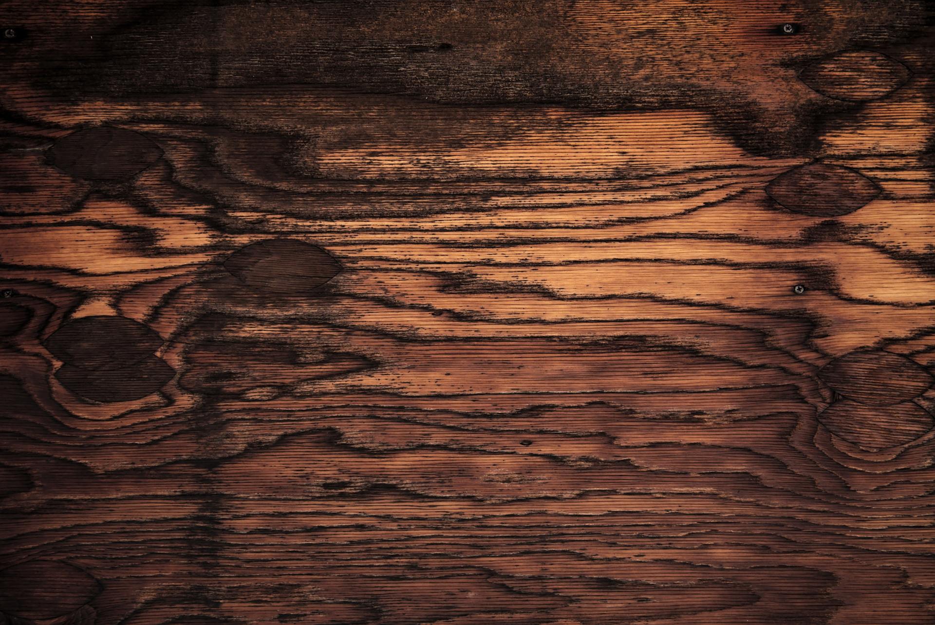
COLOUR - Brown
the magic of colour: brown
I have long been fascinated with the science, history and psychology of colour. It's something that plays a huge part in all our lives. So I thought it would be nice to share my fascination with you!
I hope you enjoy reading, and if you like what you see, please give it a share. :-)
brown: "it's the shadows and the shit which makes the light bits believable.”
- victoria finlay in her book "colour: travels through the paintbox"
brown: wavelength: roughly 600 (nanometres)
Brown is one of those colours that is a bit like Marmite, you either love it or hate it. It either conjures up images of delicious chocolate and autumn leaves, or it makes you revile with the thought of excrement and filth. But there's far more to this 'colour/non-colour than you might think. The colour brown even has its associations with the dead!
A brief history of brown
Brown is often thought of as a "non-colour" because it's not really classed by many, as a colour at all even due to its low intensity and often low saturation levels. It's a much-abused colour in the modern world, as we see it as a middle colour, neither a here nor there sort of colour, but even so, it was Marie Antoinette's favourite. There was even a brown colour that was popular in stately homes in the 1930s known as "caca du dauphin" which roughly translates as "Princely crap". But surprisingly brown has had a pretty colourful history.
The word 'Brown' comes from the Proto-Germanic 'brunaz' and old high-german 'brun'. Even since the very dawn of human existence, it's played an integral part of how we communicate, with the very first cave paintings being created with pigment made from ground dirt and earth, of ochre, umber and siennas, mixed with probably saliva and daubed onto cave walls. It's often a colour that is taken for granted but is in fact, crucial to art and our world.
The famous 16th-century Italian painter, architect, engineer, writer, and historian, Giorgio Vasari, who was hugely influential to Leonardo Da Vinci and Michaelangelo, once wrote: "sketches born in a moment from the fire of art, have a quality that finished works lack". It's true that almost all great works of art created throughout the centuries have used a multitude of pigments that have been derived from the earth, they've all come from the muck and filth beneath our feet and have been used in the making of the most magnificent creations. But there are also some browns that have come from far deeper and darker places than we may imagine.
In art history, there are pretty much two controversial brown pigments. Asphaltum and Mommia.
Asphaltum is made from an oily bitumen substance found in the Dead Sea. It's a beautiful translucent, rich brown that has a luxurious appeal to it. It was used extensively by artists from the 1600s, but the problem is that once it's used beneath other pigments, it turns into, what is effectively, treacle and proceeds to run down the canvas turning everything to brown sticky mush and ruining the artwork. It never dries and so can still be wiped and smeared for a long time after the painting is finished.
But of all the browns, Mommia is the one with the most macabre origin. in 1586 a young traveller visited a mass grave in Egypt's Valley of the kings. He entered the tomb and crawled through the passageways by torchlight to reach the burial chamber. Once there, he desecrated the bodies he found, even commenting how he "broke off all parts of the bodies...and brought home divers heads, hands, arms and feete for a shewe". These grim trophies were then sold to various European chemists, colourists and other unsavoury individuals, who got to work grinding them down and processing them to create a thick, brown bitumen-like substance. This practice continued for a fair while. The British colourist George Field, documented receiving a shipment of "Mummy" from a wealthy patron in 1809, he writes "It arrived in a mass containing and permeating rib-bone etc... of a strong smell resembling Garlic and Ammonia - it grinds easily - works rather pasty - unaffected by damp of foul air".
Perhaps a less gruesome brown pigment is derived from the cuttlefish and is one we are probably all familiar with, and one which we often have a fond sense of nostalgia towards. Sepia is the delicate brown colour of the old photos we often associate with the wild west of early America, it's that hazy brown look that makes anything it's used on appear to be from days gone by. Natural sepia is made from the ink sac of the cuttlefish. It's been used for thousands of years, since before the Ancient Greeks and Romans, by artists and scholars to create manuscripts and artworks. In the 1940s in America, music that was intended for African-American audiences was often called 'Sepia Music' until this term was later replaced with the less derogatory name of Rhythm and Blues or (RNB).
The psychology of brown, and using it in business
In colour psychology, brown is a colour of being grounded, an earth colour that denotes trust and stability. It's the colour of security, strength and belonging. Brown tends to be seen as a colour of quality, in our homes, what we drink and eat, and how we socialise. It's a colour which is about family and being connected to our loved ones and the earth in general. Brown is honest, genuine and sincere. It relates to the hardworking, industrious and reliable, with both feet planted firmly on the ground. It's about all aspects of earthiness and is often used in the branding of companies that are eco friendly and sustainable. There's a natural aspect to brown that makes us feel comfortable, which is why it tends to be used widely for businesses who are associated with agriculture, farming, the organic market and all things of a natural origin.
Its associations with wholesome food and chocolate makes it a colour which many people like, and have an affinity towards. men especially seem naturally drawn to brown, it's not a flashy colour, but it's also not as much of a 'non-colour as black or white, so it can be used to pair with other neutral colours. It is sensual, sensitive and warm, engulfing us in a feeling of calmness and comfort. It is a practical and sensible colour that implies common sense. It also hides the dirt!
Colour can be used to achieve some amazing results for your business. If you would like us to look at your brand, or see how we can use colour to create powerful branding for you, get in touch.
I hope you enjoyed reading. Please look out for our next post in the "Magic Of Colour" series. If you like what you've read here, please feel free to share on social media.
Thanks for taking the time to read our blog. :-)
Shaun Pritchard - Owntwo Creative

OWNTWO CREATIVE
Office 2249
37 Westminster Buildings
Theatre Square
Nottingham,
NG1 6LG
t: 07955102522
Business Hours:
Monday - Friday
09:00 - 18:00
GIve us a buzz
Contact Us
Thank you for contacting Owntwo Creative.
We'll be in touch as soon as possible.
Please try again later.
All Rights Reserved | Owntwo Creative


