COLOUR - blue
the magic of colour: blue
This is the first blog in my series about colour. I have long been fascinated with the science, history and psychology of colour. It's something that plays a huge part in all our lives. So I thought it would be nice to share my fascination with you!
As statistically the most popular colour globally, it made sense to start with the much-loved blue.
I hope you enjoy reading, and if you like what you see, please give it a share. :-)
the sky is not blue!
blue: wave length: 450-490nm (nanometres)
When we look up to the sky our eyes see the deep and delicate blues for as far as we can see.
But we are being deceived!
No, this is not some weird conspiracy theory, it's scientifically factual. The sky is transparent but the reason we see it as blue is that the blue light coming from the sun, has a very short wavelength compared to the other colours (apart from violet) but very high energy and frequency, so it scatters through water molecules in the atmosphere far more than the other colours in the spectrum. This means our eyes perceive the sky as blue Even though violet has the shortest wavelength, and the highest energy in the visual spectrum, the reason the sky isn't seen as violet, is because sunlight contains very little violet, but is very heavily saturated by blue light.
A brief history of blue
Blue is by far the most popular and loved the colour of all the colours. But this has not always been the case. Much of the science and history of blue may come as a surprise.
It seems that in our ancient history, colours were far less important to the human experience than they are today. When reading through Greek texts, historians have noted many strange colour descriptions. In the Odyssey, for example, Homer makes hundreds of references to white and black, but colours like red and yellow are only mentioned a few times. The colour blue, it turns out, is never mentioned. Instead, the author uses descriptions like "wine-dark" to describe blue items such as the sea. To explain this, Scientists and historians mostly agree that it seems that early humans were mostly colour blind, only able to see black, white, red and then later, yellow and green. So they quite literally could not see blue at all, not until much later on. So for centuries, there was no language to describe the colour of the sea, the sky or forget-me-nots. Early humans simply did not experience colours as we do today.
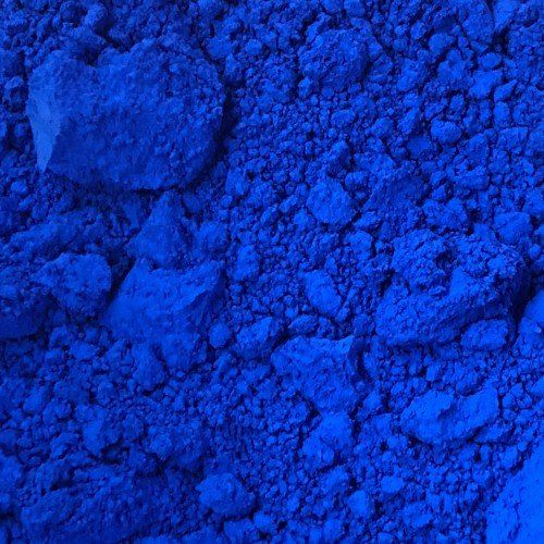
The first synthetic blue pigment to have been used, Egyptian Blue, was created by the ancient Egyptians around 2200 B.C, about the same time as the Great Pyramids were built. They found that by combining copper, sand and azurite or malachite, and then exposing it to extremely hot temperatures, they could create an opaque blue glass, which could then be crushed up and added to gum arabic or egg whites to make a beautiful sparkling blue paint. However, if the measurements or temperatures were not calculated correctly, it would turn into a "green mess!
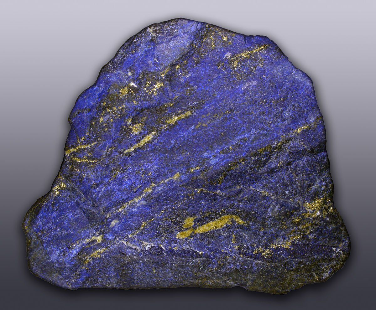
The most expensive and highly regarded of the blues is Ultramarine. It's made from the semi-precious stone called Lapis Lazuli mostly found in the Lapis mines of Afghanistan. Due to its ingredient's exotic location, Ultramarine was very expensive and hard to get hold of. A pound of Ultramarine was worth more than gold, and so it was highly sorted after and given an almost celestial symbolism. It's thought that when Michaelangelo painted his "The Entombment" in 1500-1501, he left it unfinished, as he was unable to afford the expensive pigment to complete the painting of the Virgin Marys blue robes.
The psychology of blue, and using it in business
Blue signifies professionalism, trust, honesty, intelligence, efficiency, peace and calmness. As an appetite suppressant, it's not great for food-related businesses. It has the physiological effect of lowering the heart rate and blood pressure, so is great for businesses who want to portray trustworthiness.
It's a great colour for financial, corporate, legal, medical, cleaning or tech businesses. blue was determined to be the favourite colour, in studies, among both men and women. It's used a lot within the cybersecurity industry, and also extensively within the corporate world.
There is a large body of evidence to suggest that blue light can help reduce instances of suicides at train stations. In Japan in 2008, authorities installed soothing blue lights on all the platforms at several train stations. The rate of suicides subsequently fell by 84%. Since then, the same blue lights have been installed at several train stations around the world, including at Gatwick airport train station.
Colour can be used to achieve some amazing results for your business. If you would like us to look at your brand, or see how we can use colour to create powerful branding for you, get in touch.
I hope you enjoyed reading. Please look out for our next post in the "Magic Of Colour" series. If you like what you've read here, please feel free to share on social media.
Thanks for taking the time to read our blog. :-)
Shaun Pritchard - Owntwo Creative
.

OWNTWO CREATIVE
Office 2249
37 Westminster Buildings
Theatre Square
Nottingham,
NG1 6LG
t: 07955102522
Business Hours:
Monday - Friday
09:00 - 18:00
GIve us a buzz
Contact Us
Thank you for contacting Owntwo Creative.
We'll be in touch as soon as possible.
Please try again later.
All Rights Reserved | Owntwo Creative
